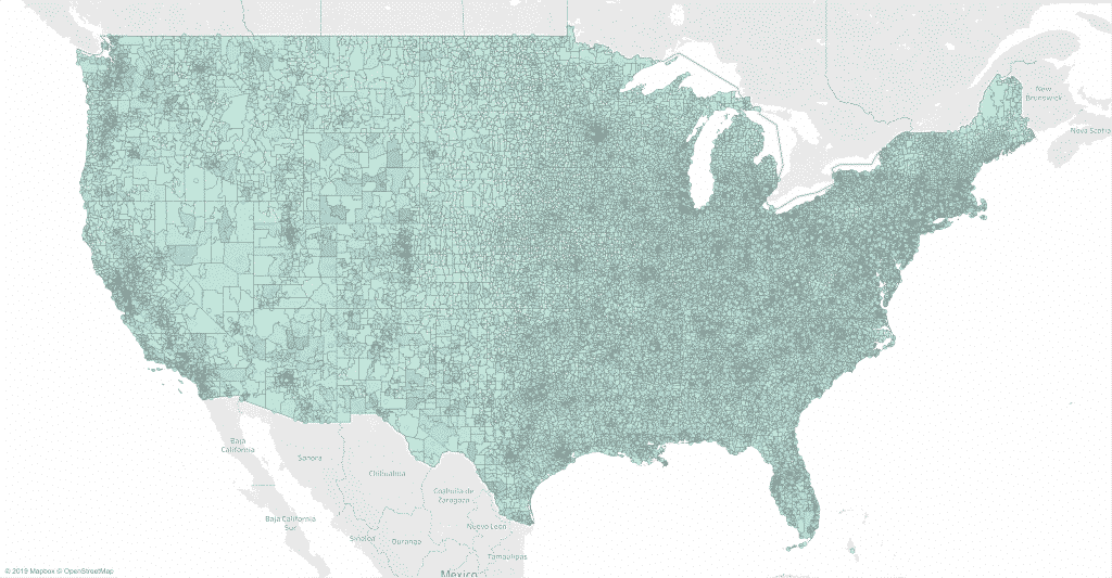
Information with a geographic element is best visualized with a map. However, large regions tend to dominate maps regardless of their actual importance. I will show you possible ways to solve this problem and let you create the correct data map for your own purposes without the need for coding.
Problem with standard data maps (cartograms)
When visualizing data, it is worth considering not only the correctness of the data display. Different types of visualization evoke different interpretations in the mind of the reader.
Let me explain what I mean by showing different visualizations of the same geographic data: 4G mobile internet coverage in Germany. We focus on my o2 provider, which offers both the worst and the cheapest network in Germany. A standard data card would look like this:
Germany’s 16 federal states are colored according to the 4G o2 coverage provided in May 2018, according to the allnet-flatrate.net website. Dark blues represent good 4G coverage up to 97% in Berlin, while blues represent patchy coverage up to 41% in Brandenburg.
Such a standard data map is called a cartographic map, and while it is technically correct, I often find it misleading. Why? Because readers tend to think big things are more important than small ones. In the case of maps, large regions seem more important, even though they may be home to fewer people than smaller regions.
A standard cartogram displays the size of an area in relation to area, while readers mistake size for importance. How to fix it?
Solution 1: Dimensions of data points in space (bubble maps)
First of all, you can determine the size of the abstract data points by importance. In our case, this would be equivalent to using the state population as the size variable instead of the area shown above. By placing data points on a map, the reader quickly sees which region each point represents.
The data and color coding are the same as before. The only difference is switching from a cartographic map to a bubble map. Suddenly the situation for o2 customers is better. Darker shades of blue prevail. Lighter shades of blue no longer stand out.
Cities such as Hamburg or Berlin are larger in size than before, while geographically large states with few inhabitants are smaller than before.
Solution 2. Dimensional states (discontinuous cartogram)
A similar solution would take the states directly and measure them according to population size. Gaps appear where geographically large states are narrowing due to a small population.
Again, the data and color coding are the same as before. Unfortunately, states with a similar geographic center, such as Berlin and Brandenburg in northeastern Germany, now overlap. The following solution avoids this.
Solution 3. Dimensional states (continuous cartogram)
The final solution that I propose is perhaps the most impressive. State sizes are again adjusted according to population to reflect their importance. However, this time the resulting gaps have been filled.
Despite the fact that such a cartogram looks nice, it deprives the map of the main purpose: orientation in space. As states stretch and contract, it takes time to understand what you are looking at.
Creating your own data maps
In my opinion, there is no one-size-fits-all solution here. Which approach do you prefer?
I made a brilliant interactive web app so you can create the datamap you think is best. You can find it here. I wrote it with R. The script is located here on github.
The problem of data visualization goes beyond presenting data truthfully and beautifully. I see the real challenge in getting the reader to understand the data correctly without effort. Solving this problem requires thinking about the data and the reader when visualizing the data.
Like this post? Share this with your followers or follow me on Twitter!
